Solving Repetitive UI Work With a Personal Design System
Client
Design System
Year
2024
A reusable component library and token system built to speed up freelance UI work without sacrificing quality
Scope of Work
Why I built this design system
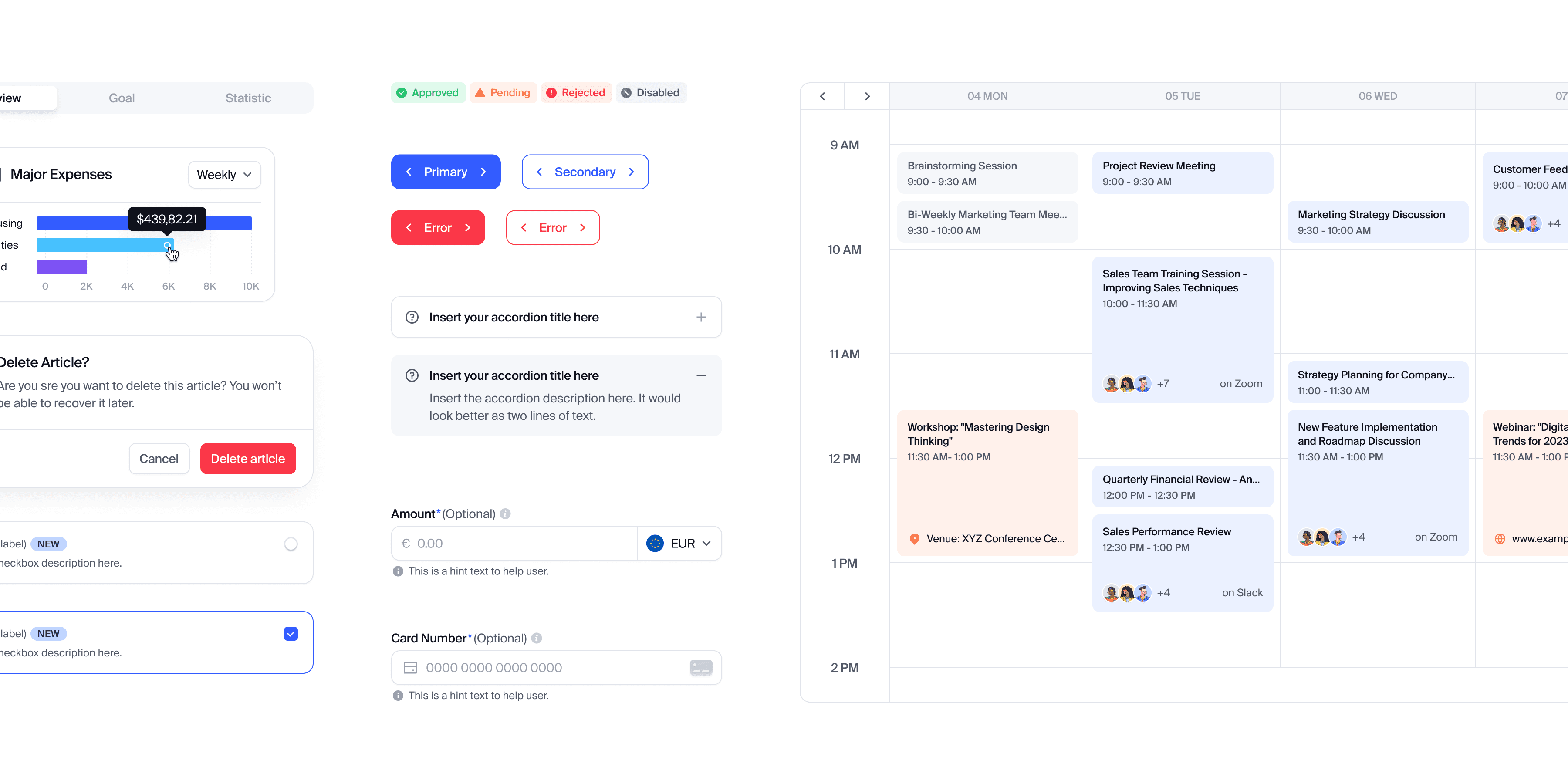
I've been designing UI for freelance clients for a while now, and I kept running into the same pattern. Every new project meant rebuilding the same buttons, inputs, cards, and navigation from scratch, just with a different coat of paint. The brands were different, but the underlying problems were almost always the same.
I wanted a system I could actually reuse, not just a file of components, but something with real structure: consistent tokens, clear documentation, and components built to adapt to different brands without falling apart. So I built one. Now instead of starting from zero every time, I start from a working foundation and spend my time on what actually matters, solving each client's specific design problems.

A naming system that scales without guesswork
As the token set grew, I didn't want anyone (including future me) to have to guess what a token does just from its name. So I built a layered naming pattern: element, tone, and emphasis. Element defines what part of the component the token applies to, like background, text, stroke, or icon. Tone carries the semantic meaning, whether it's a neutral state or something like warning, error, success, or verified. Emphasis adds a variant within that tone, like strong, weak, or weaker, for when a component needs more than one level of the same meaning.
This means a token like bg.error.strong tells you exactly what it does just by reading it, no need to open the file and hunt for context. It's made the system easier to maintain as it's grown, and easier for anyone new to pick up quickly.